Coast to Coast KAL
Re-launched and refreshed, the Coast to Coast Wrap is back in a new yarn with a new KAL! Originally designed in 2018, this has consistently been one of my best sellers and personal faves, and I am so thrilled to offer an official knit-along for this project! I know the mosaic colorwork on this beauty looks intimidating, but I promise you it’s actually a breeze and this is a casual ease-into-the-new-year type of KAL. The kits are available NOW and I’ve included a calendar of all pertinent dates over the course of the 6 week knit-along below along with lots and lots of info on the design, the KAL, making size modifications, and the color combos.
But first, some quick links:
Sign up for the Two of Wands newsletter to get all updates sent right to your inbox.
Visit the KAL blog post at any time for all info and updates.
Watch the welcome video, color combining video, and all video tutorials on the Two of Wands YouTube channel. (available throughout the KAL, details in the calendar below)
Purchase a kit for the Coast to Coast Wrap.
View the free pattern for the Coast to Coast Wrap.
Purchase the printer-friendly PDF pattern for the Coast to Coast Wrap. (available 2/24)
Join the Crew of Wands Facebook Page to connect with other makers participating in the KAL. Here you can share your projects, get motivated, encourage others, and get technical support.
Follow along and post your WIPs and finished pieces on Instagram. Use the hashtags #CoastToCoastKAL #CoastToCoastWrap #ColorTheoryYarn #TwoOfWands #CrewOfWands and tag @twoofwands @lionbrandyarn
Just like with the other make-alongs I have hosted in the past, there’s nowhere to officially sign up for the Coast to Coast KAL, and while I have outlined specific dates for when videos launch, there’s no rule that you have to start on time or end on time either! All of these resources are simply available for guidance and motivation, as I want this to be a stress-free project to start the new year.
For this KAL, everything will be going down here on the blog, on IG, and in the Crew of Wands Facebook group. On IG you can share your projects with the official hashtags (#CoastToCoastKAL and #CoastToCoastWrap), and in the Crew of Wands Facebook group you can easily connect with other makers, share your projects, and get helpful feedback should you run into any difficulties with the patterns. Let’s take a peek at the calendar:
December 11
Kits and mood boards launch, updated pattern goes live
December 15
Welcome videos launch - I’ll be chatting details on the inspo, construction, techniques, and modifications as well as doing a deep dive on the color combos and going over how to put your own together
January 5
Official start of the KAL - mosaic knitting tutorial goes live
February 2
Finishing touches tutorial goes live
February 13
That’s a wrap - share your finished pieces and styling!
In between you can expect color combo guidance, styling tips, and a lot of fun! Checking out everyone else's color combos and progress is always one of my favorite parts of a KAL like this.
Some of you might be asking - why a re-vamp of the OG pattern? Fun fact, when I designed the Coast to Coast Wrap in 2018 I had a very specific color combo in mind and couldn’t find all of those colors in a single yarn palette, so I ended up combining two yarns with similar gauge (Lion Brand’s Touch of Alpaca and Wool-Ease). Back in 2023, the Our Maker Life team hosted a KAL for the project and since some of the colors I used had since been discontinued, I decided to re-knit it in Color Theory and put together a few options for combos using that palette of 18 colors. Cut to this summer when we launched another 6 colors in Color Theory and I knew I wanted to officially re-launch the pattern and offer some really beautiful themed combos using the now 24-color palette to showcase the new additions. I had several projects to wrap up before I could dedicate time to this, and with the chaos of the holidays out of the way I think January is the perfect time to indulge in a special project like this for oneself.
If you know me you know I LOVE a theme, and nothing gets me more jazzed than putting together themed color combos. I had an absolute blast working on the mood boards for the Landscape and Vista Wrap MAL in 2024 and the Genres MAL in 2025, so I knew I had to do something similar for this KAL. The design itself already has so much meaning - each mosaic chart represents a different part of the country I passed through on a road trip from LA to NYC in 2018, so I couldn’t take away from that. Sticking with that vibe, I came up with the concept to choose combos based on landmarks around the country, be it national parks, iconic cities, or manmade marvels.
Aaaaaand if you know me you also know that I have no chill when it comes to indulgence and so what started out as 12 combos quickly turned into 25, lol. Honestly I could keep going forever and ever but I had to put a cap on it so it wouldn’t be too overwhelming for you! I made sure to include cool tone options, warm tone options, full color options, neutral options, and unexpected pairing options. There’s truly something for everyone! And if none of them are speaking to you, don’t worry - I have a foolproof formula that will help you put together your own (more on that below!).
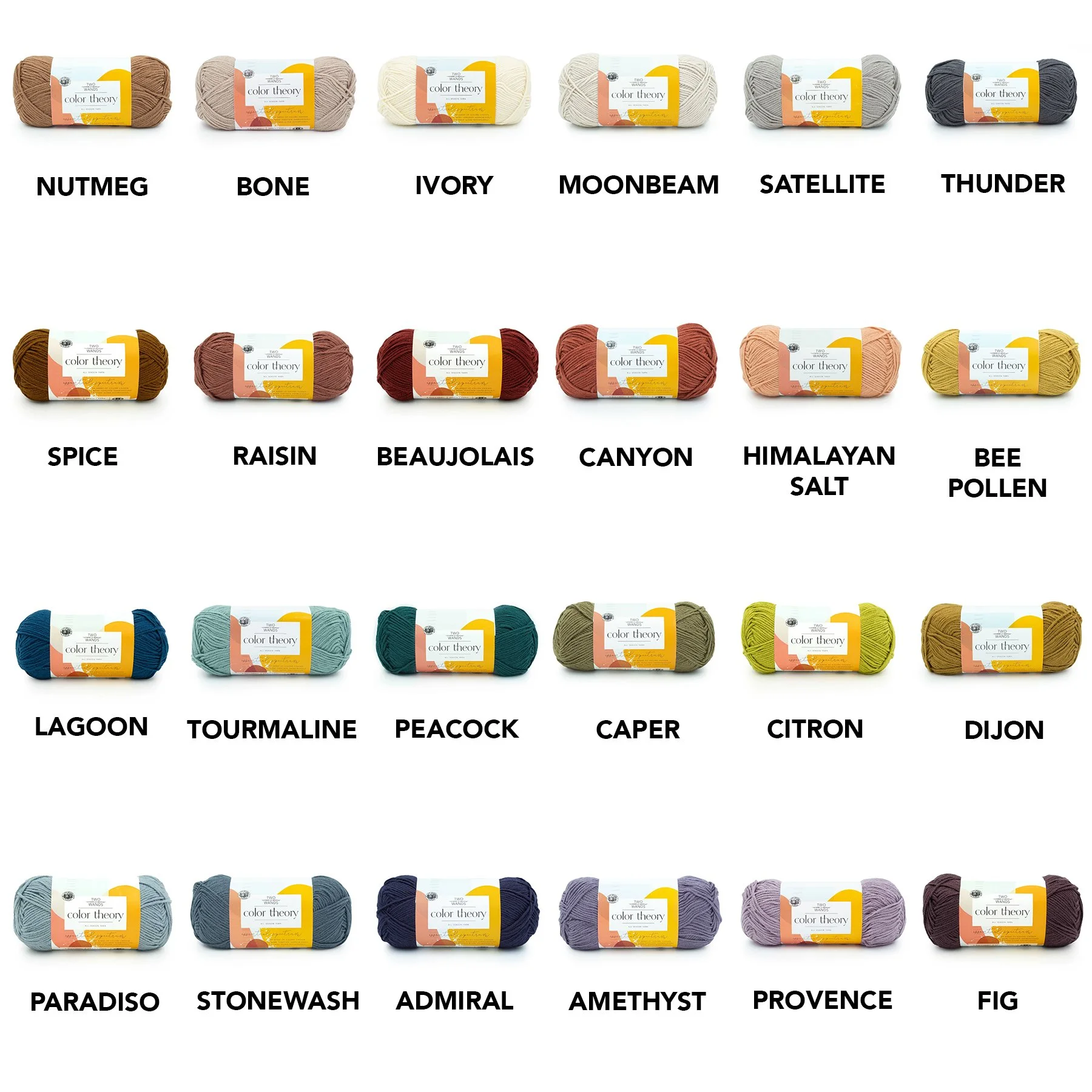
The current Color Theory palette consists of 24 colors, with seasonal hues and an array of tints and shades to build endlessly gorgeous combos. For reference, here is a look at the full palette:
And without further ado, let’s take a look at all of the landmark-themed combos!
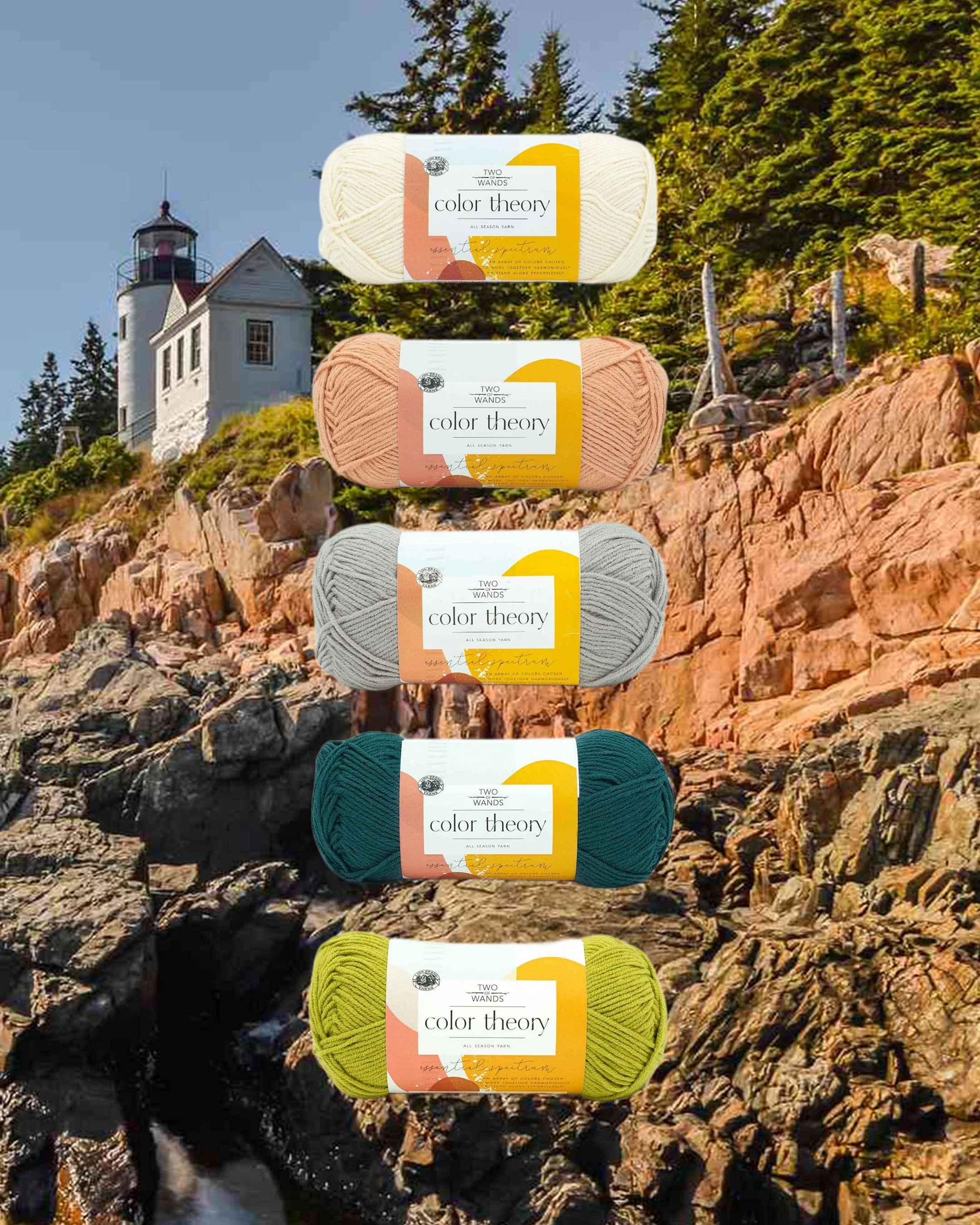
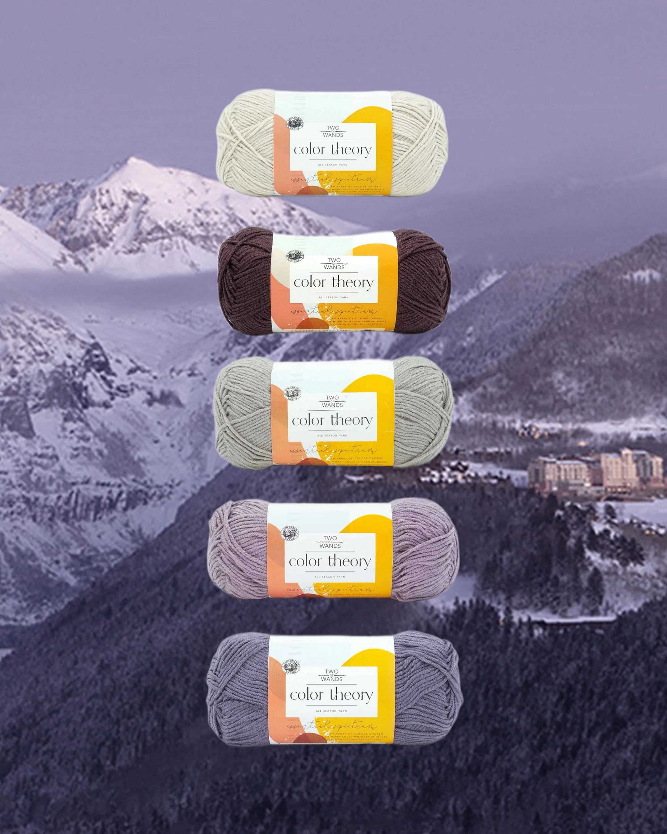
ACADIA NATIONAL PARK
Featuring: Ivory, Himalayan Salt, Satellite, Peacock, Citron
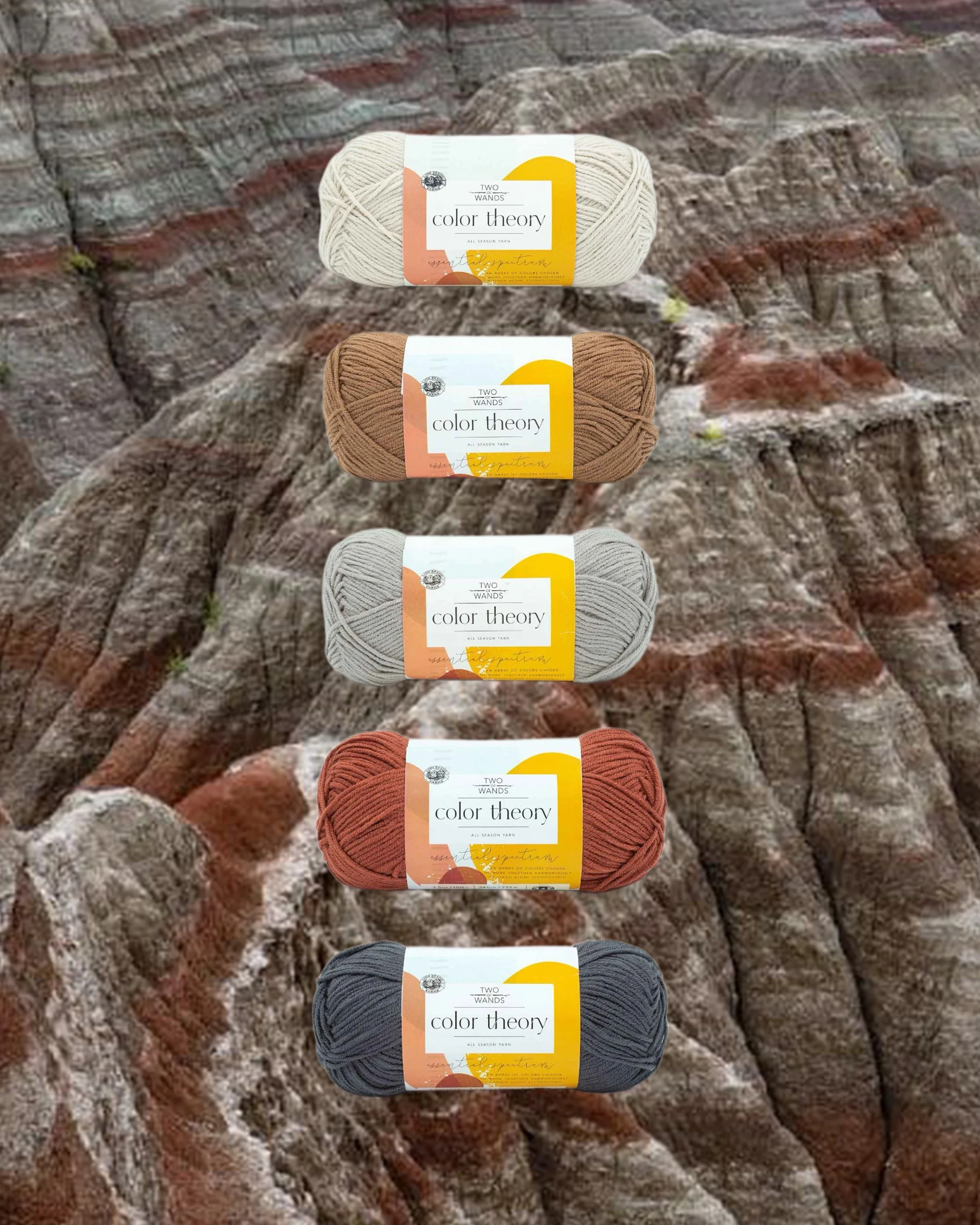
BADLANDS
Featuring: Moonbeam, Nutmeg, Satellite, Canyon, Thunder
BEACON HILL
Featuring: Bone, Nutmeg, Ivory, Beaujolais, Caper
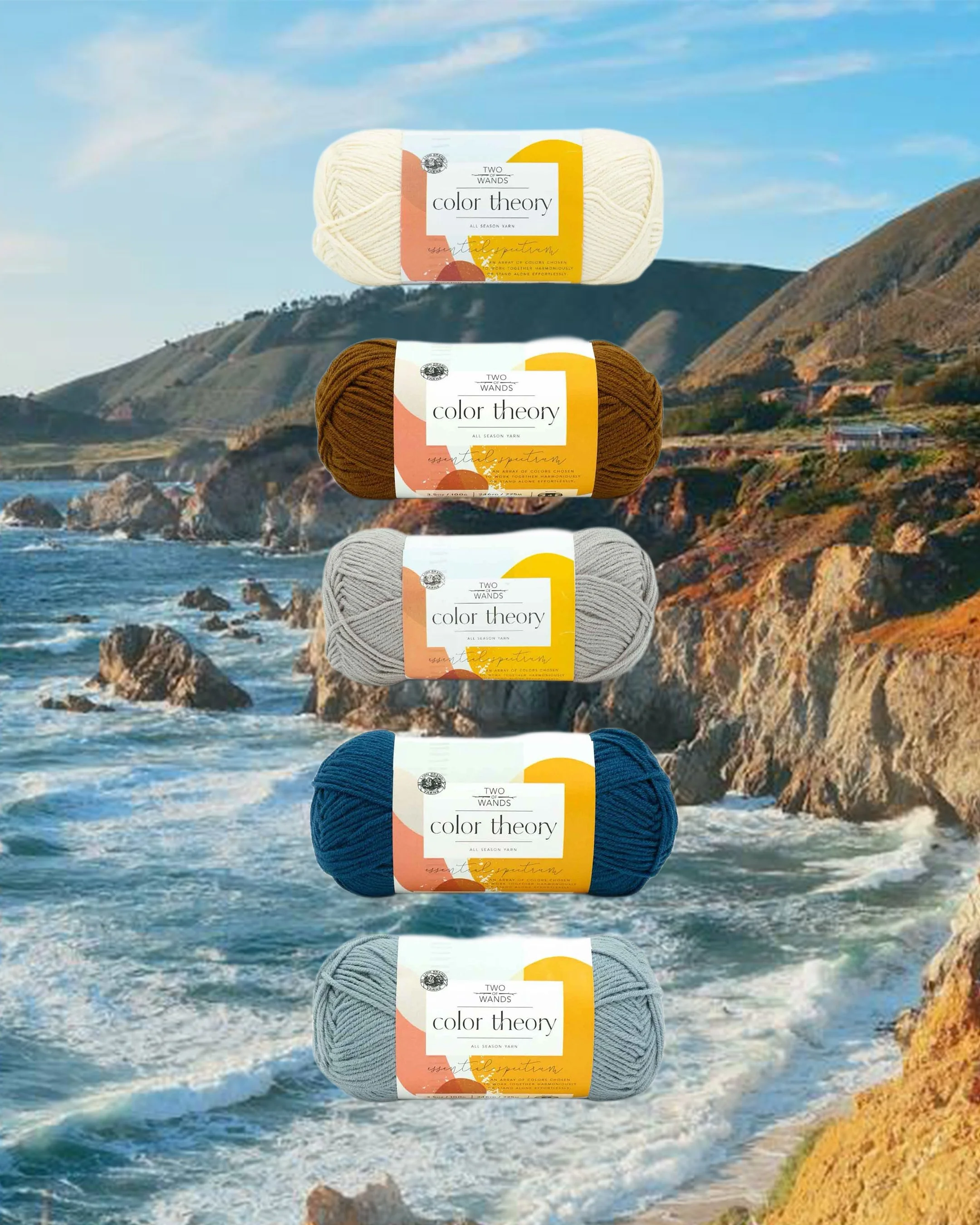
BIG SUR
Featuring: Ivory, Spice, Satellite, Lagoon, Paradiso
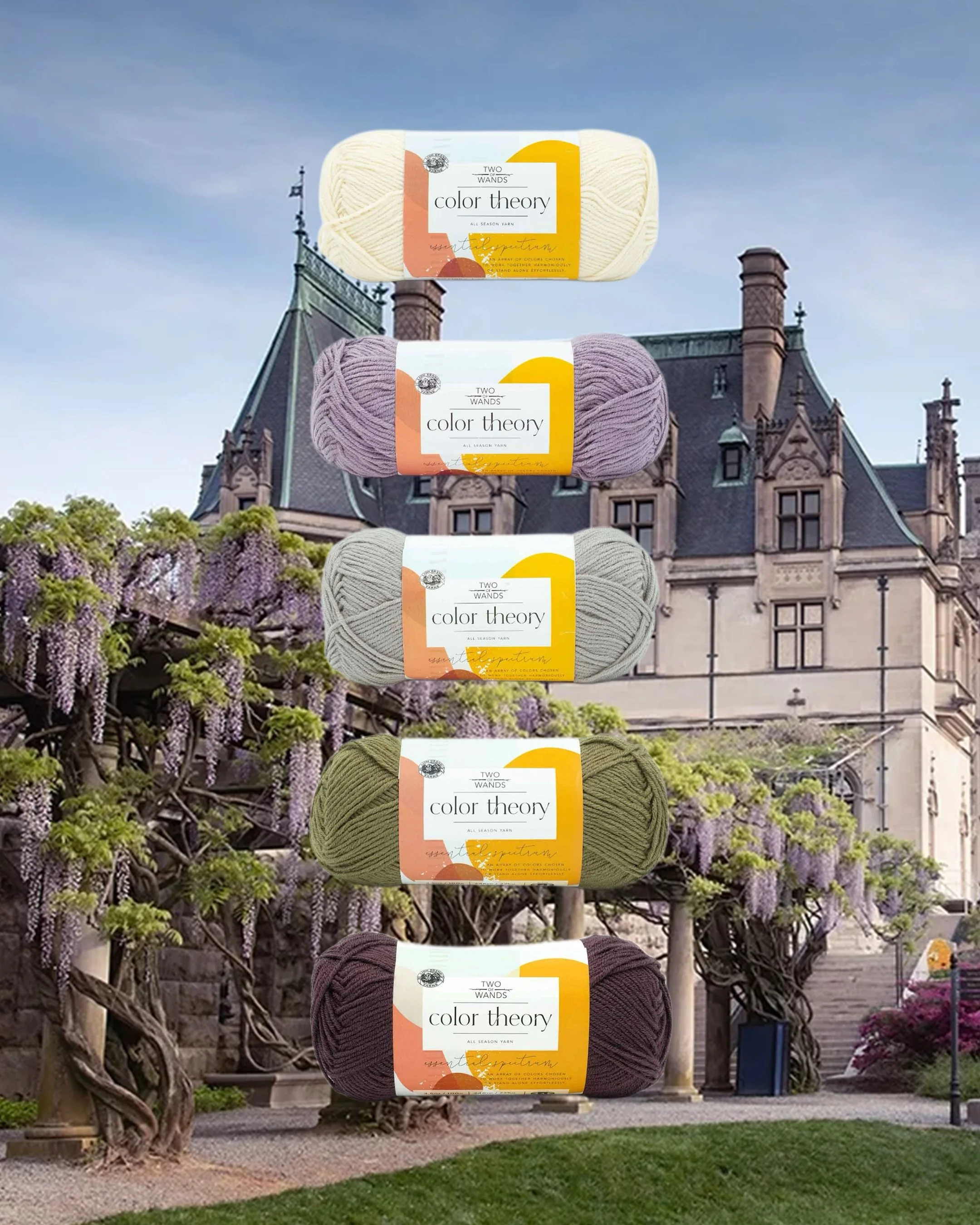
BILTMORE ESTATE
Featuring: Ivory, Provence, Satellite, Caper, Fig
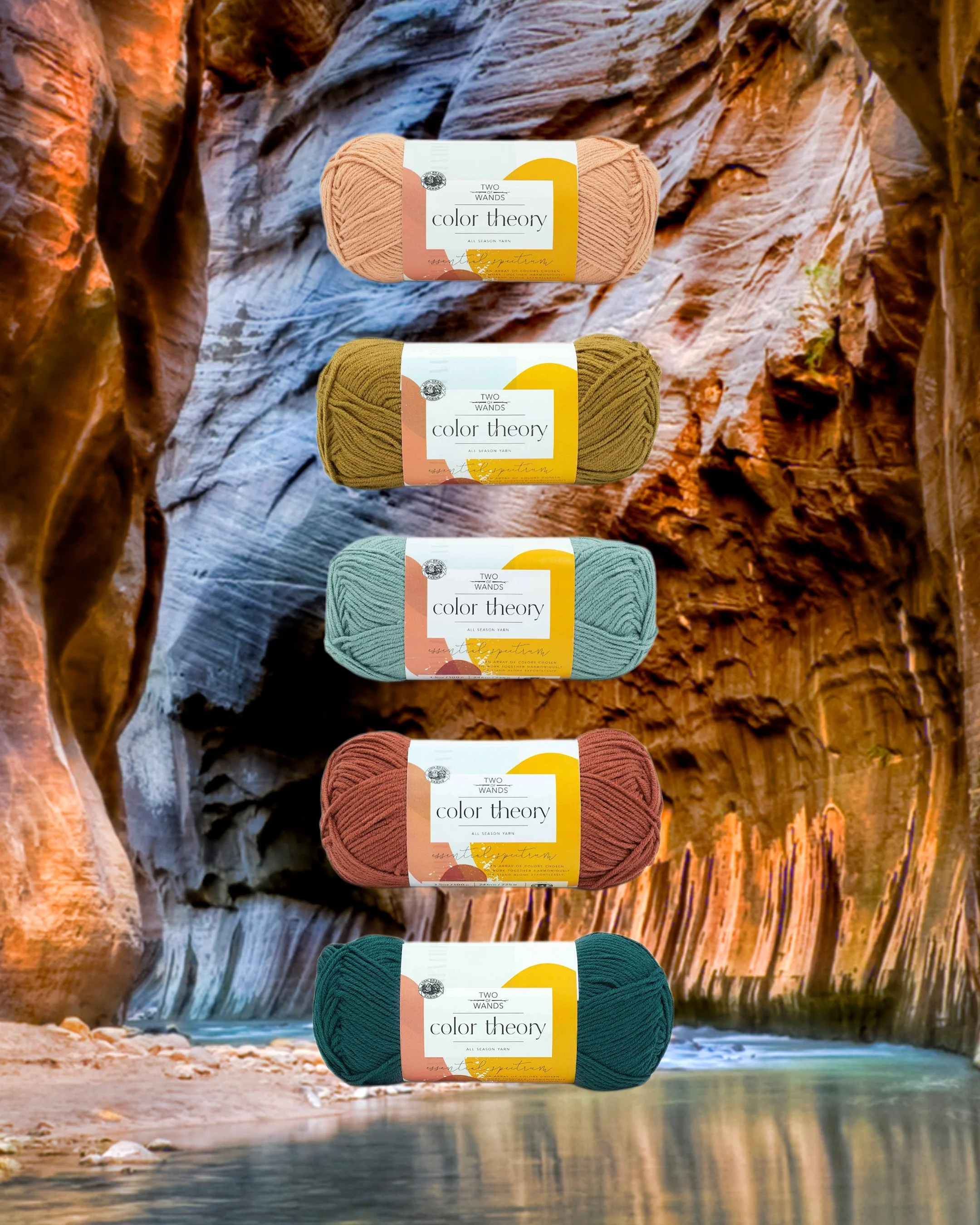
ARTS + CRAFTS
Featuring: Ivory, Peacock, Moonbeam, Paradiso, Dijon
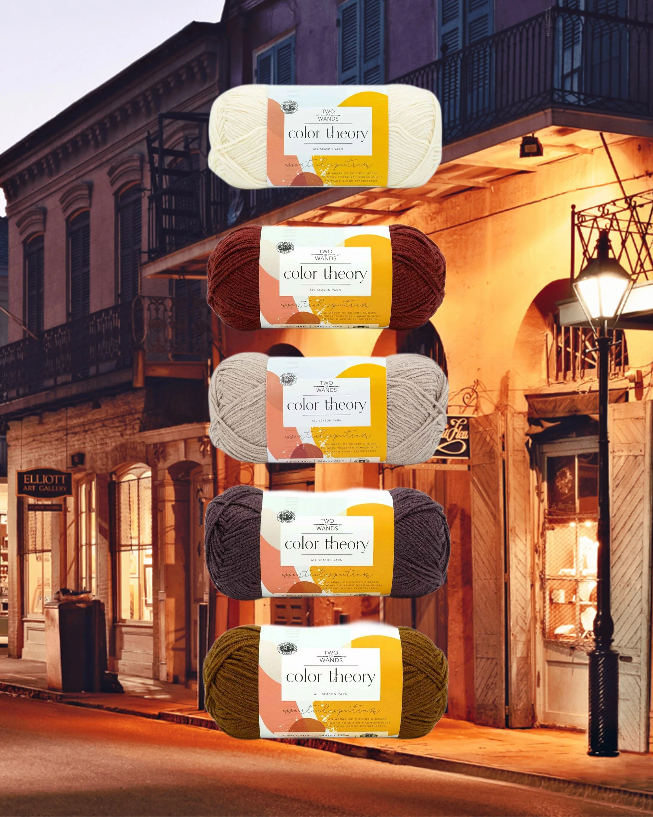
FRENCH QUARTER
Featuring: Ivory, Beaujolais, Bone, Fig, Spice
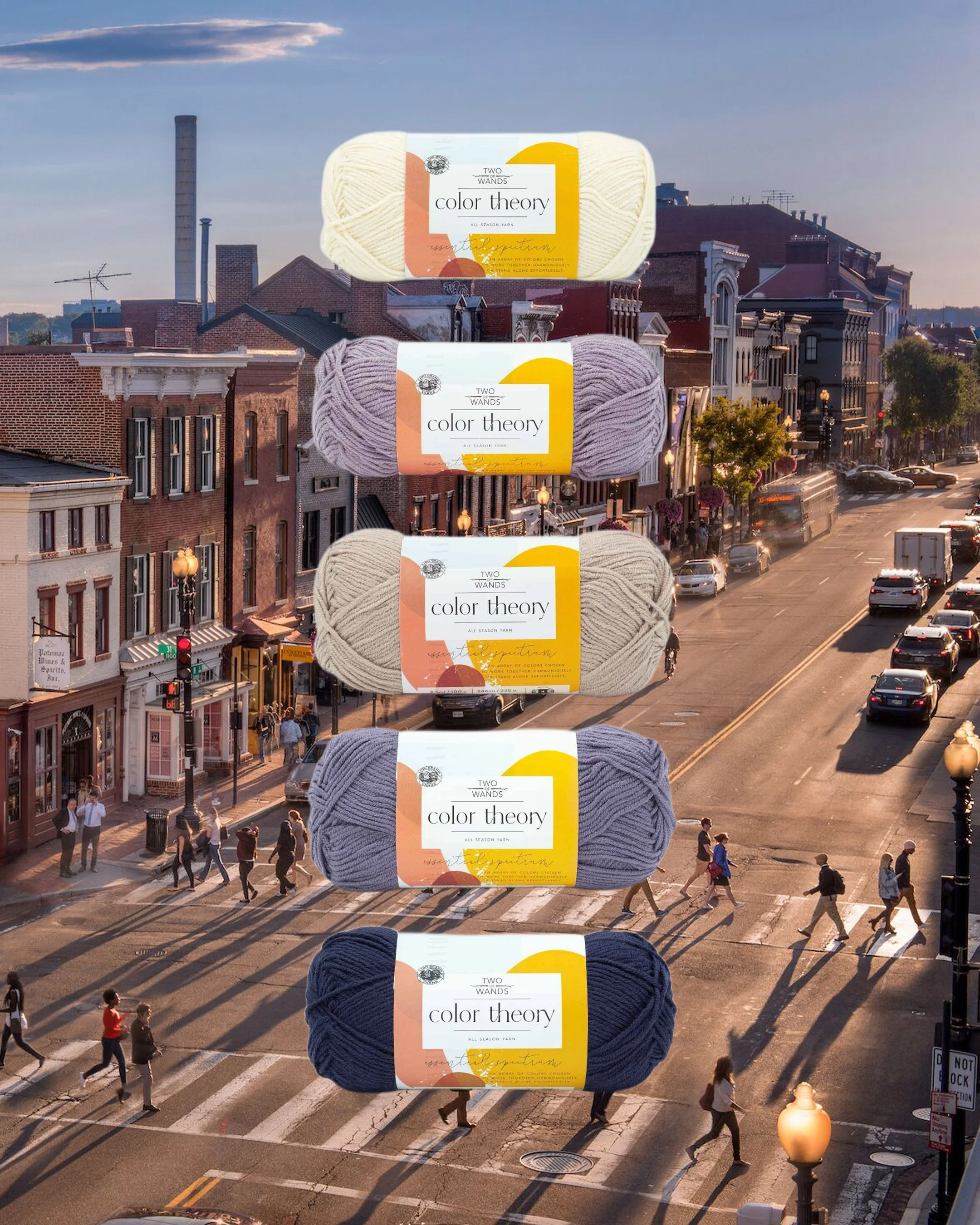
GEORGETOWN
Featuring: Ivory, Provence, Bone, Amethyst, Admiral
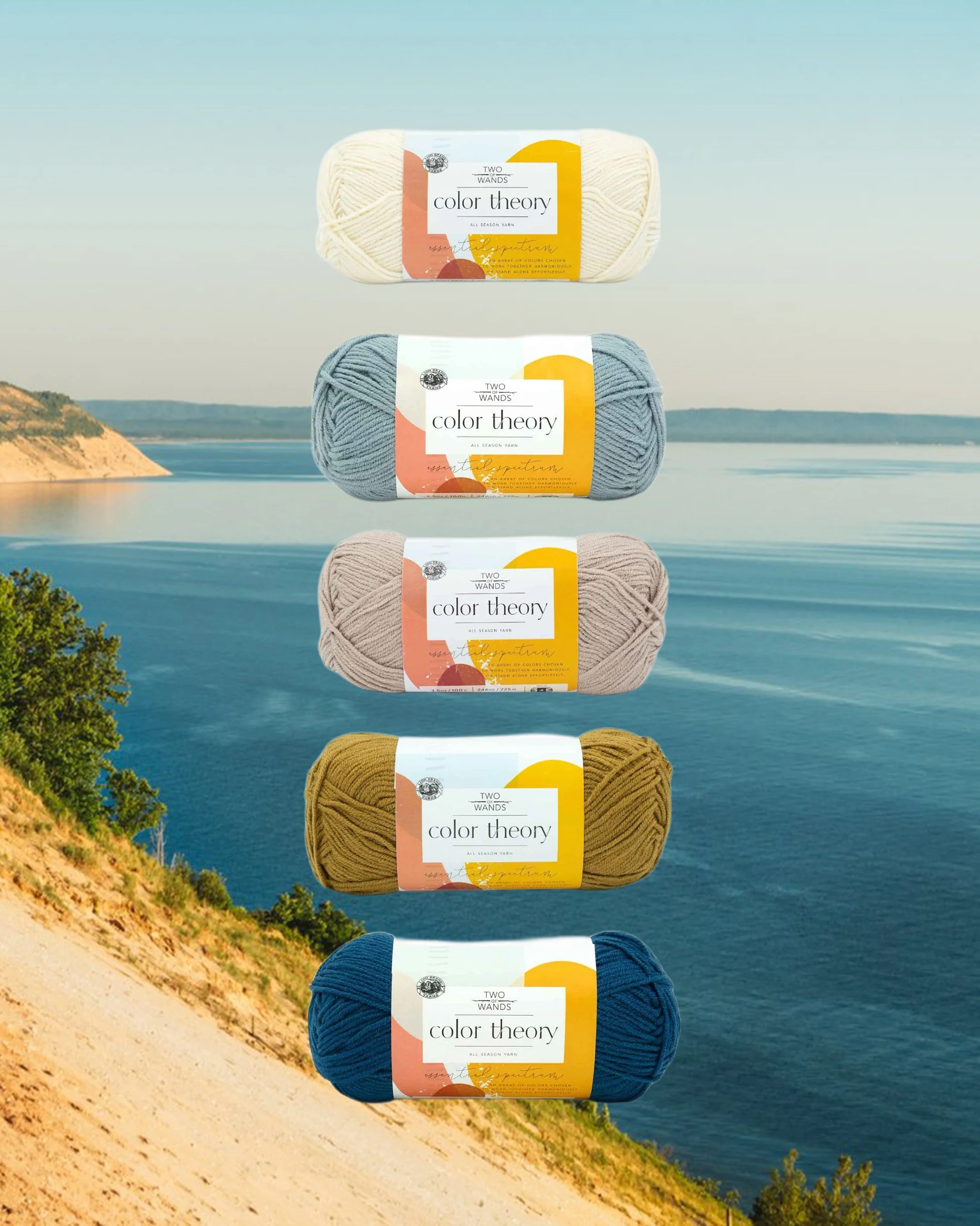
GREAT LAKES
Featuring: Ivory, Paradiso, Bone, Dijon, Lagoon
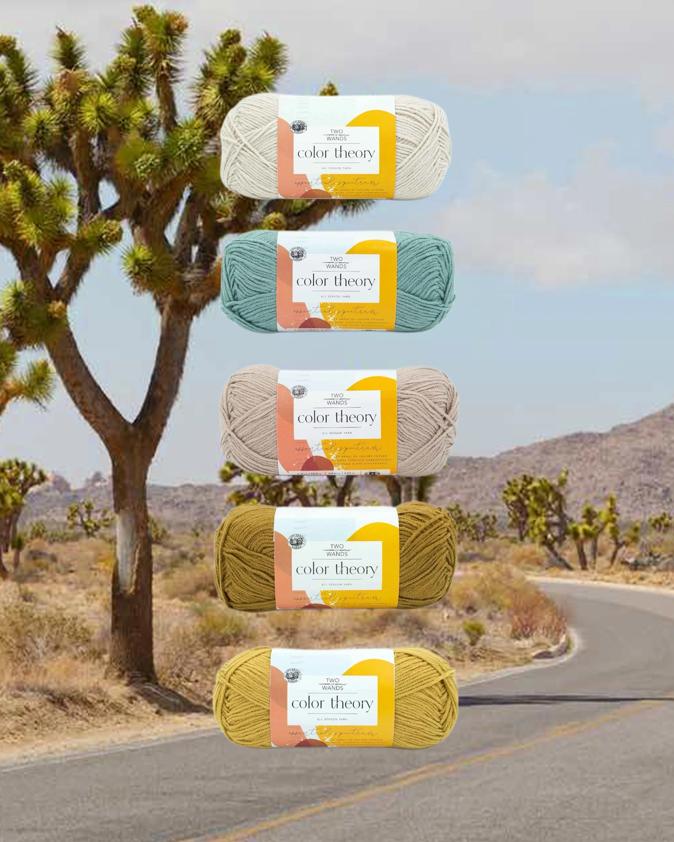
JOSHUA TREE
Featuring: Moonbeam, Tourmaline, Bone, Dijon, Bee Pollen
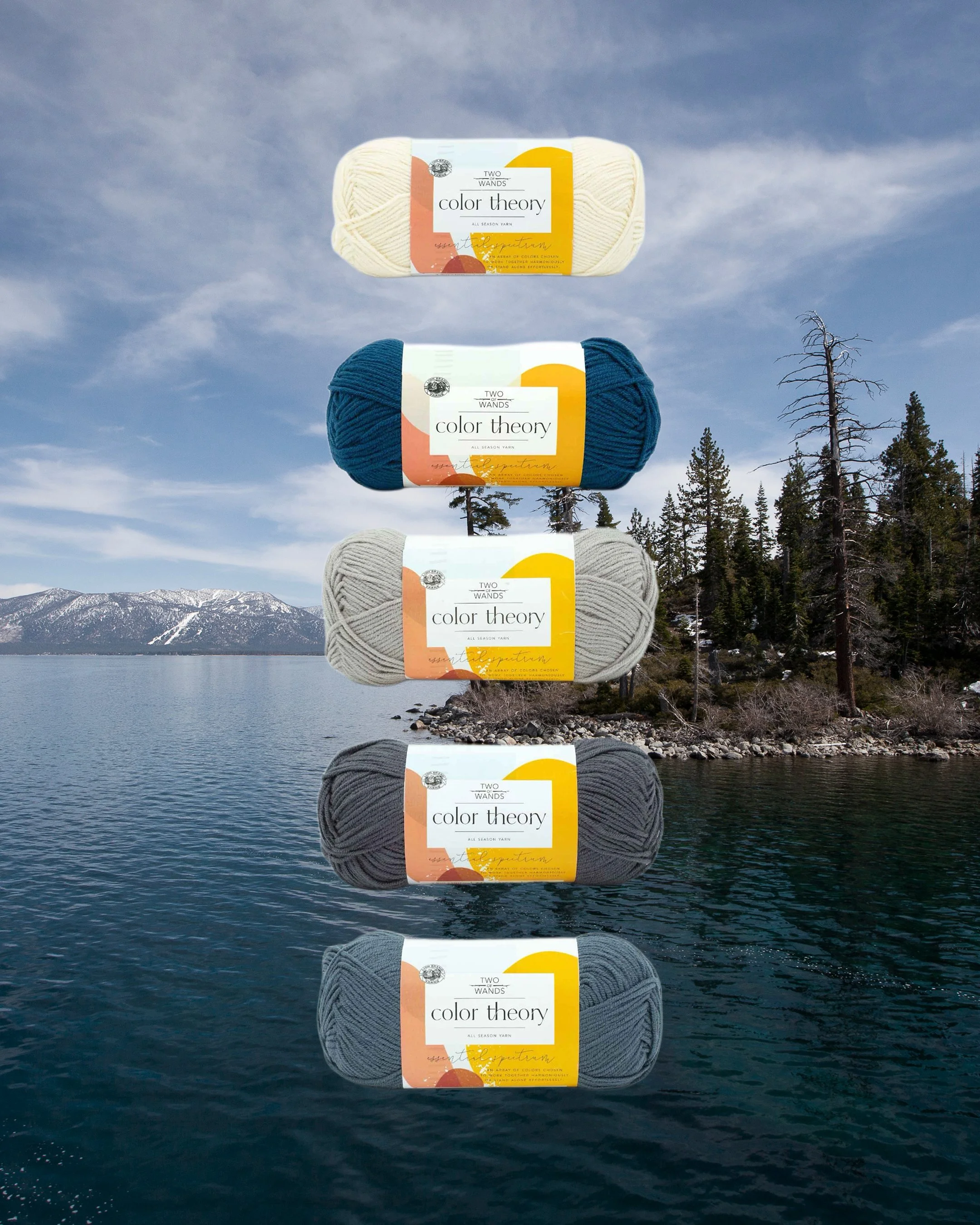
LAKE TAHOE
Featuring: Ivory, Lagoon, Satellite, Thunder, Stonewash
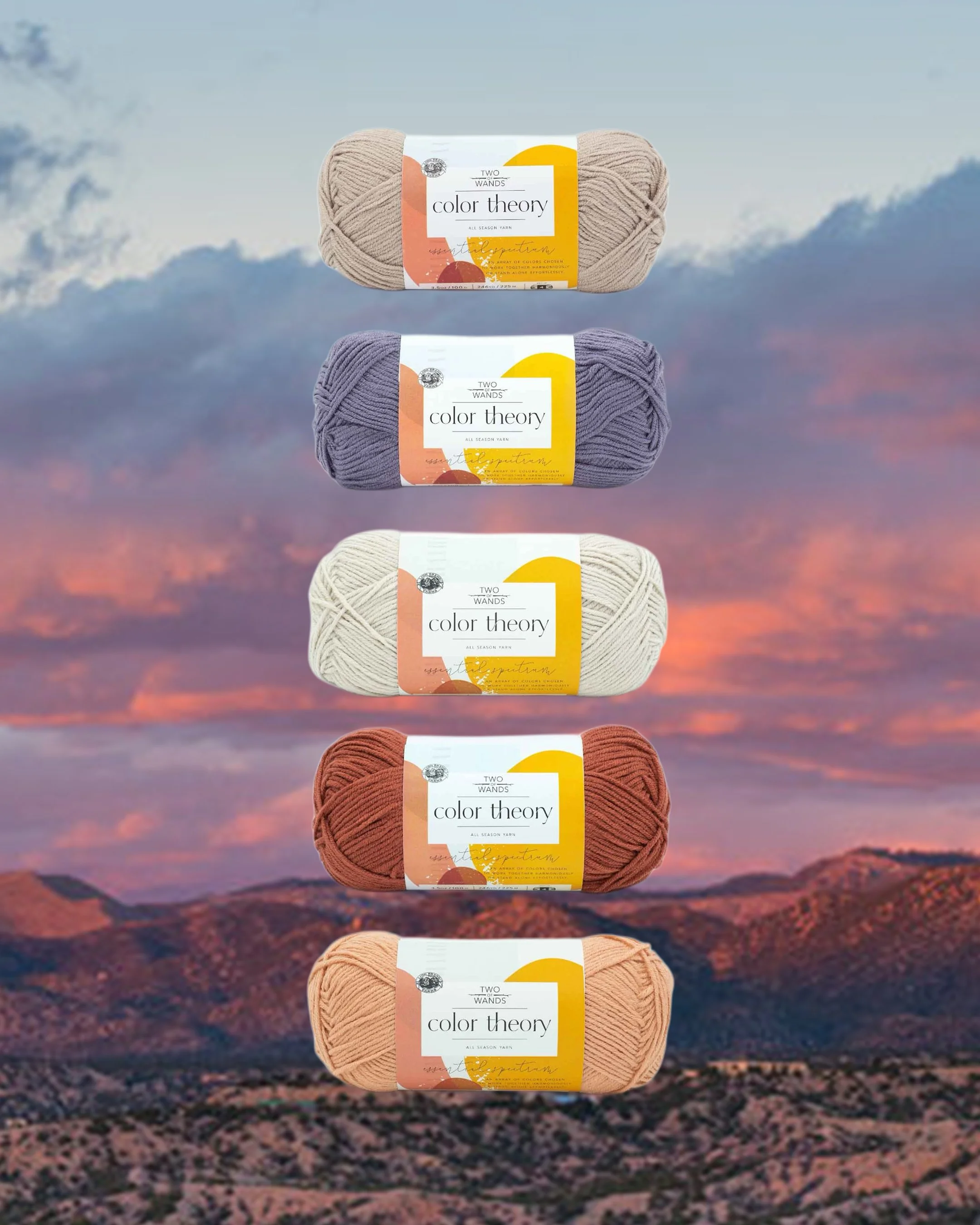
MARFA
Featuring: Moonbeam, Bone, Ivory, Spice, Nutmeg
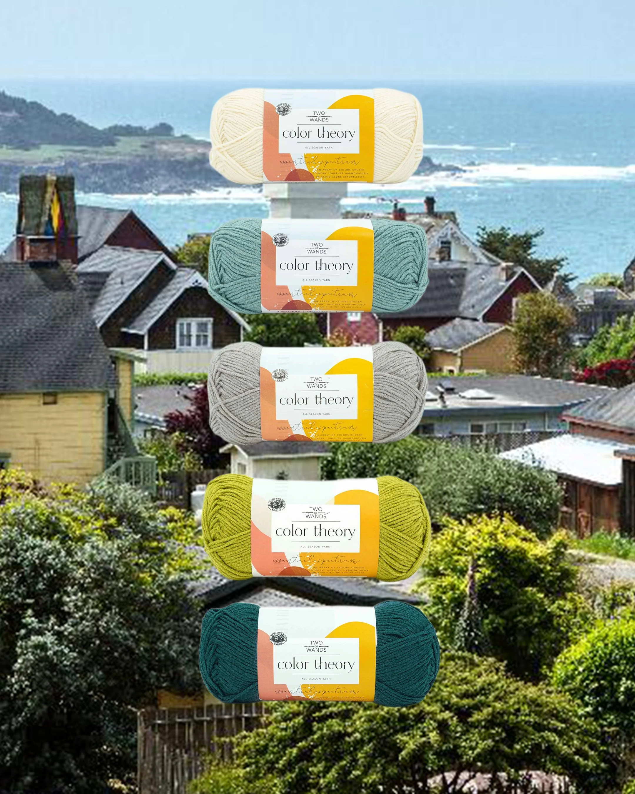
MENDOCINO
Featuring: Ivory, Tourmaline, Satellite, Citron, Peacock
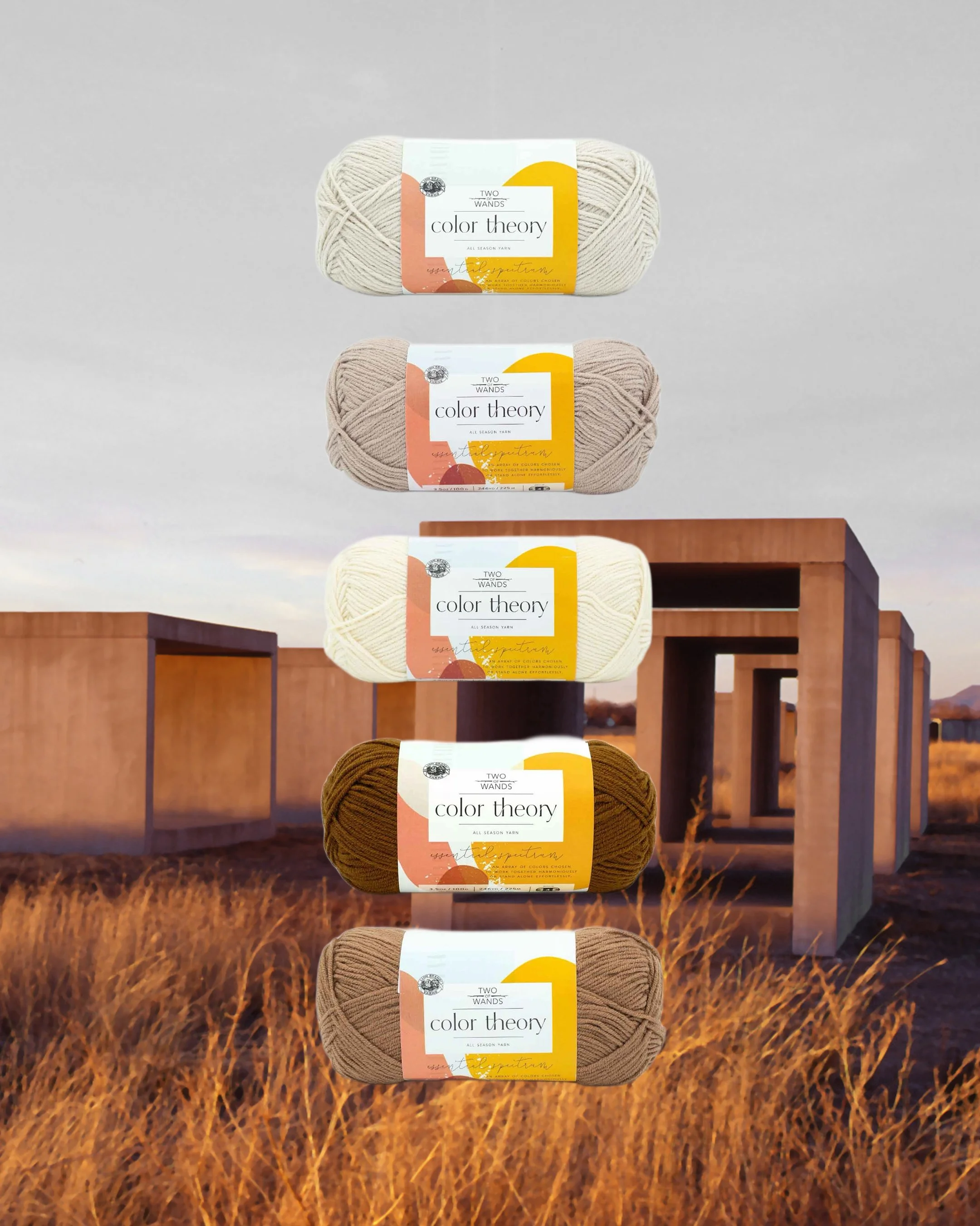
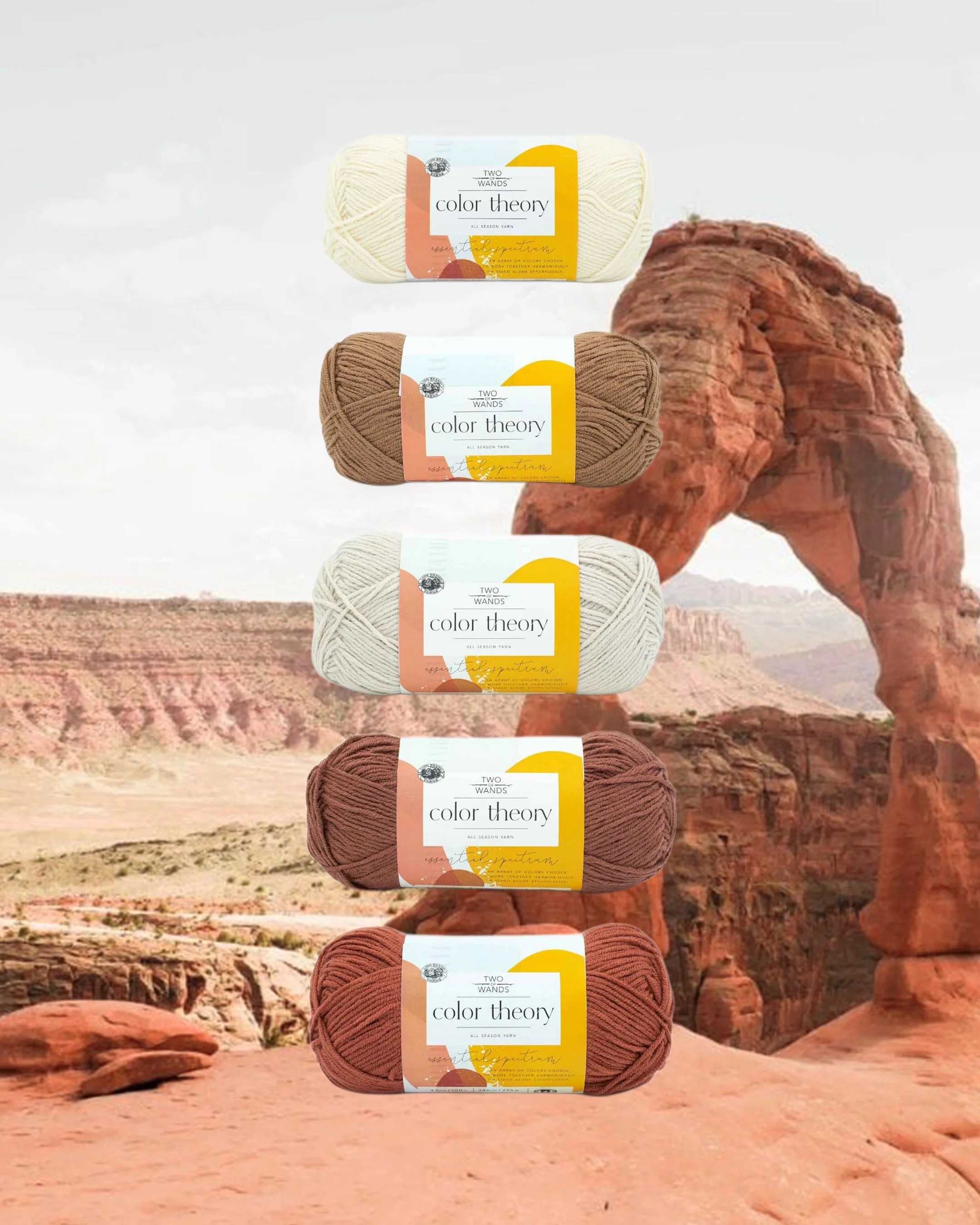
MOAB - THIS IS THE ONE I CHOSE!
Featuring: Ivory, Nutmeg, Moonbeam, Raisin, Canyon
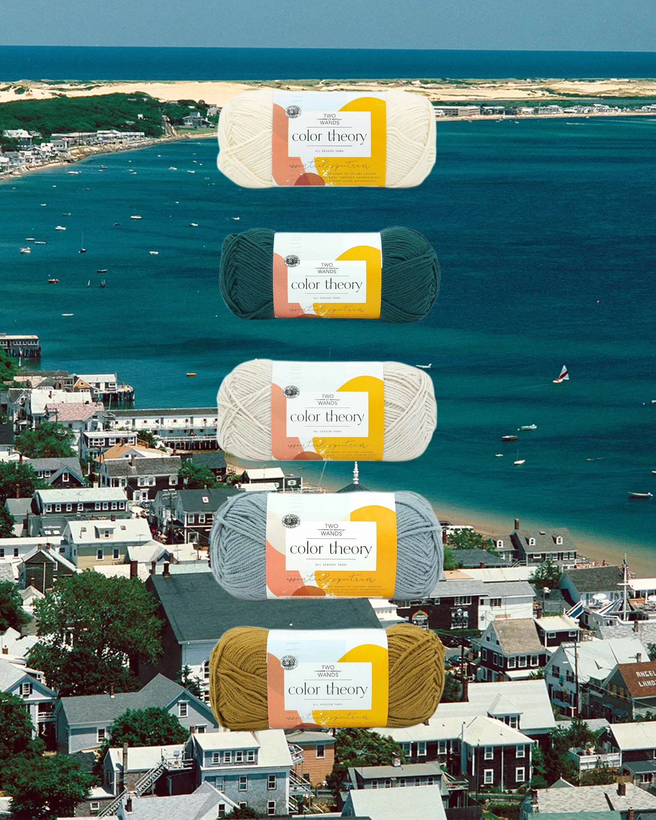
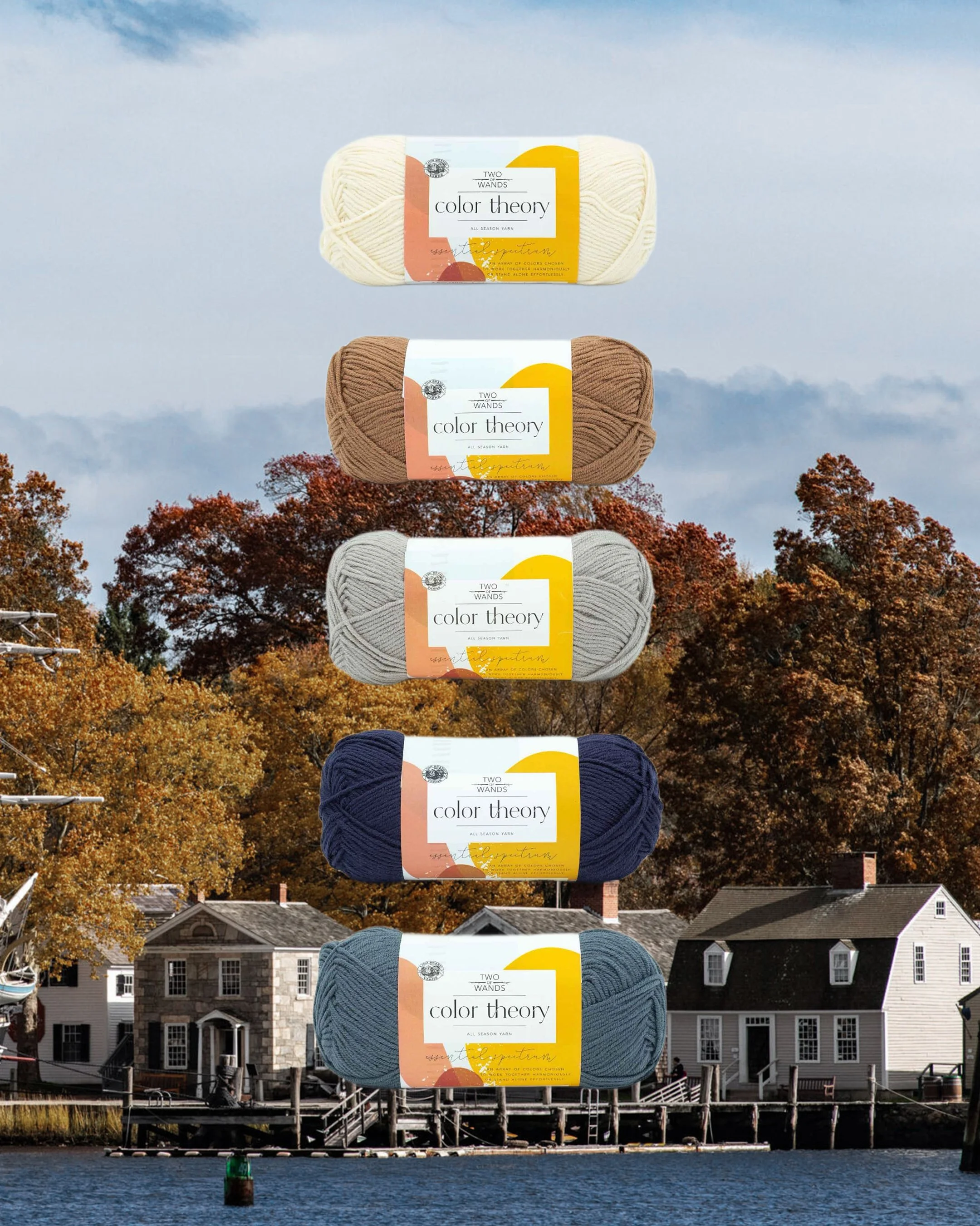
MYSTIC SEAPORT - THIS IS THE CLOSEST TO THE ORIGINAL COMBO
Featuring: Ivory, Nutmeg, Satellite, Admiral, Stonewash
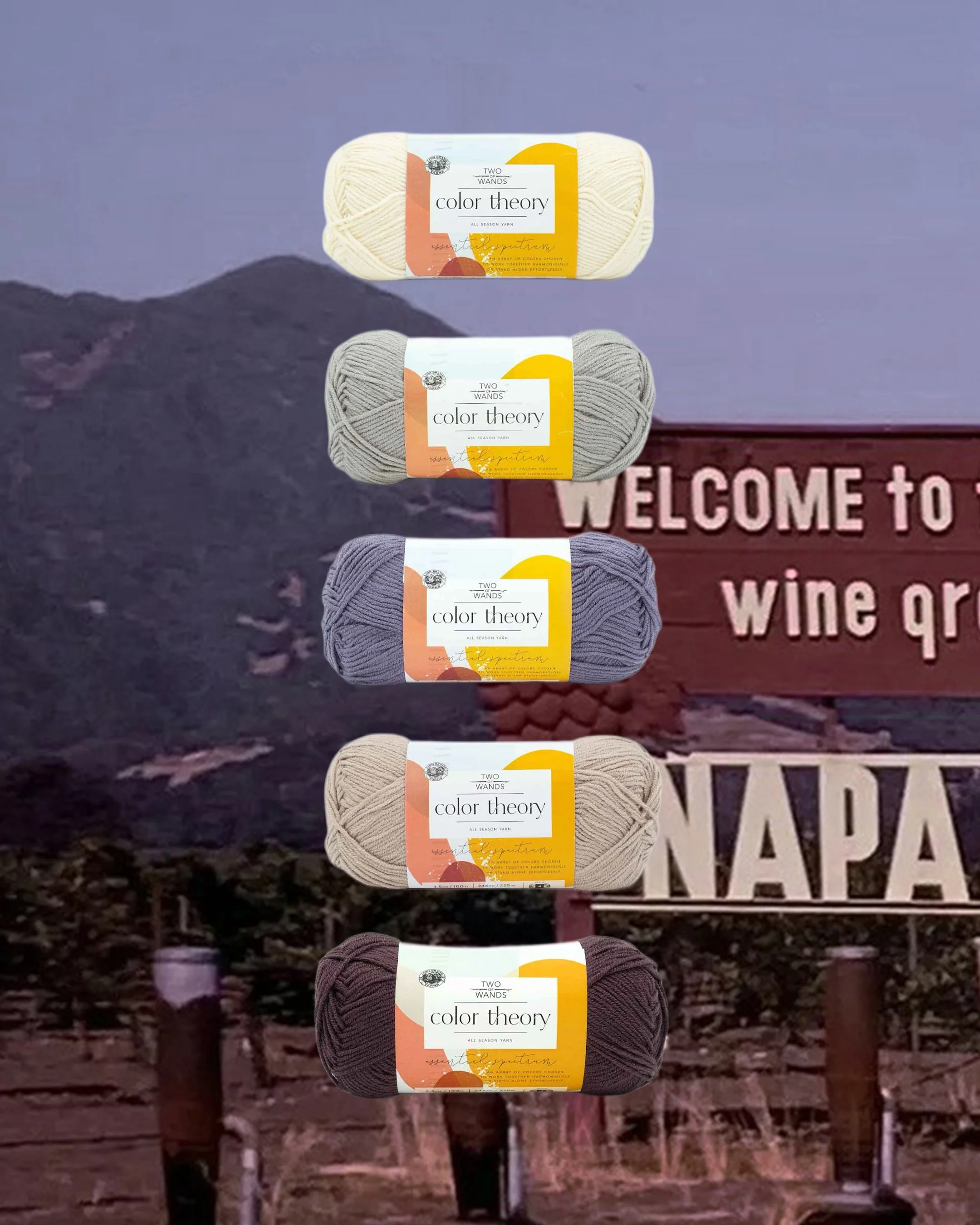
NAPA VALLEY
Featuring: Ivory, Satellite, Amethyst, Bone, Fig
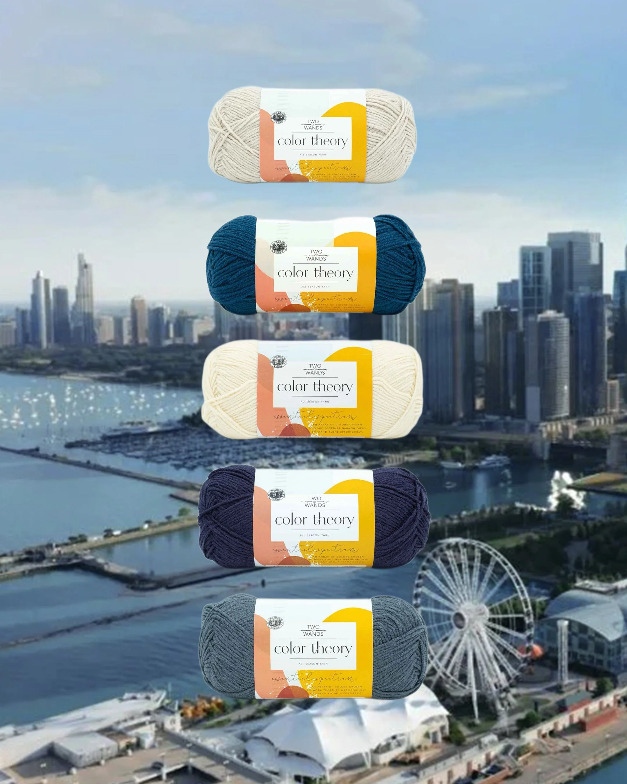
NAVY PIER
Featuring: Moonbeam, Lagoon, Ivory, Admiral, Stonewash
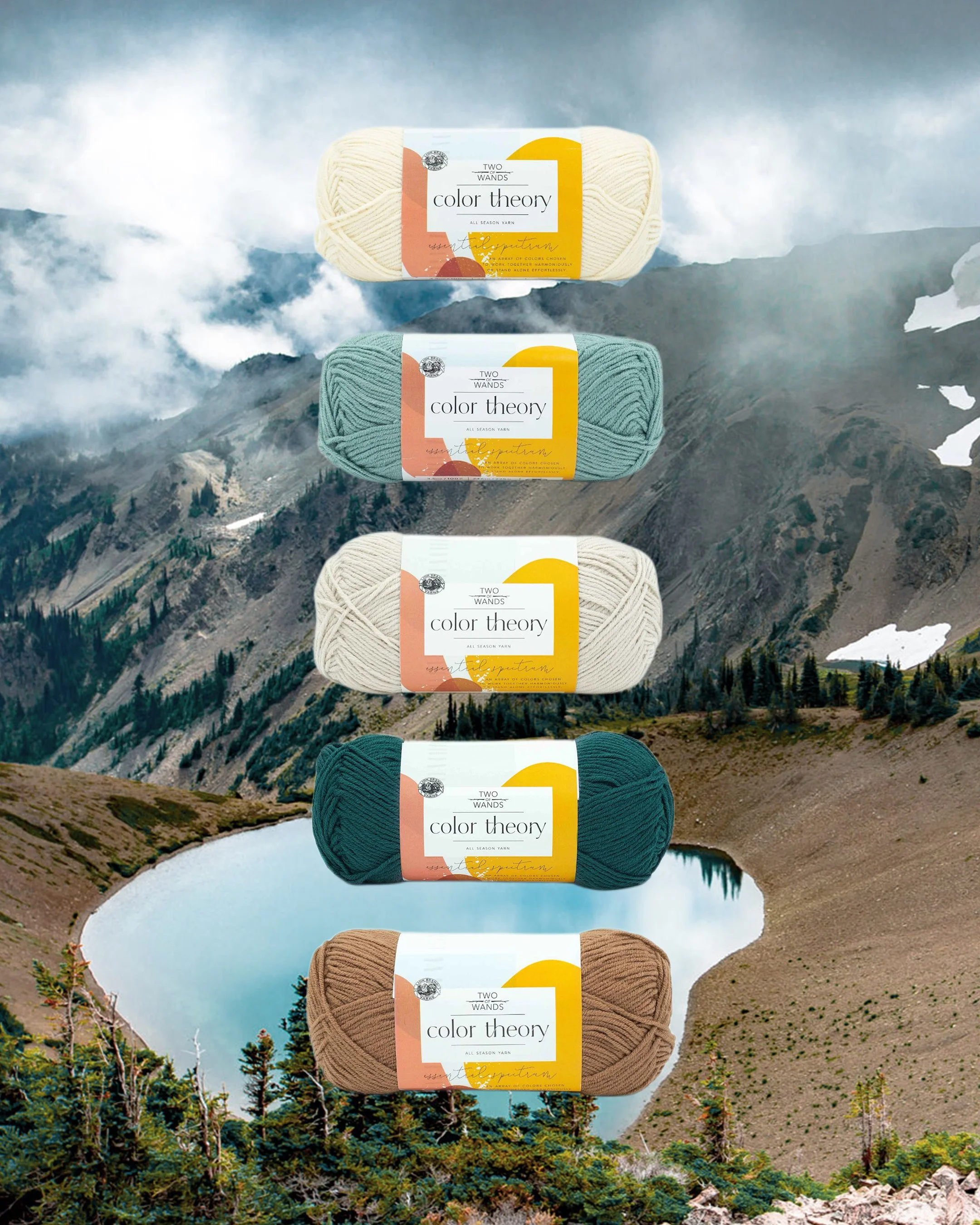
OLYMPIC NATIONAL PARK
Featuring: Ivory, Tourmaline, Moonbeam, Peacock, Nutmeg
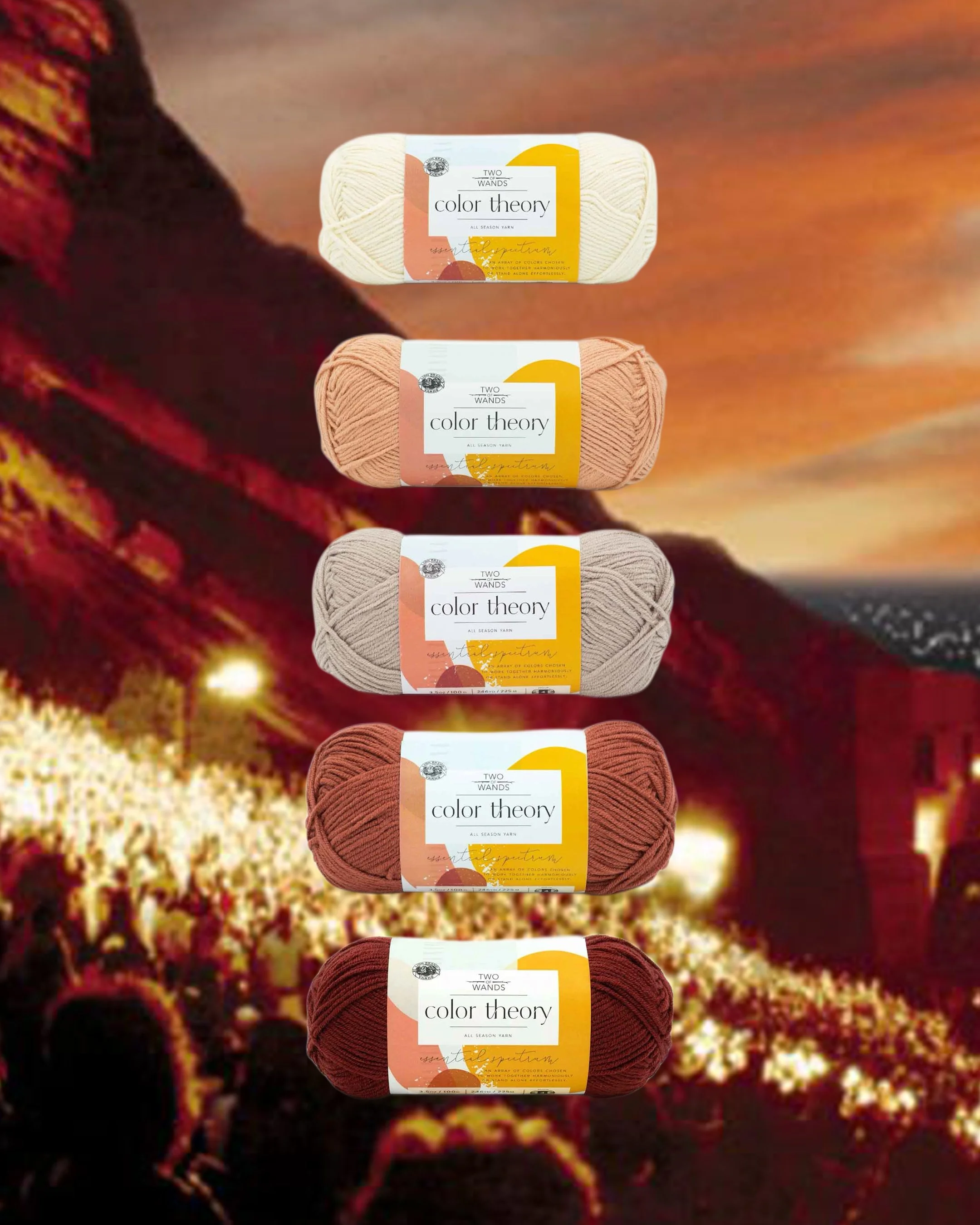
RED ROCKS
Featuring: Ivory, Himalayan Salt, Bone, Canyon, Beaujolais
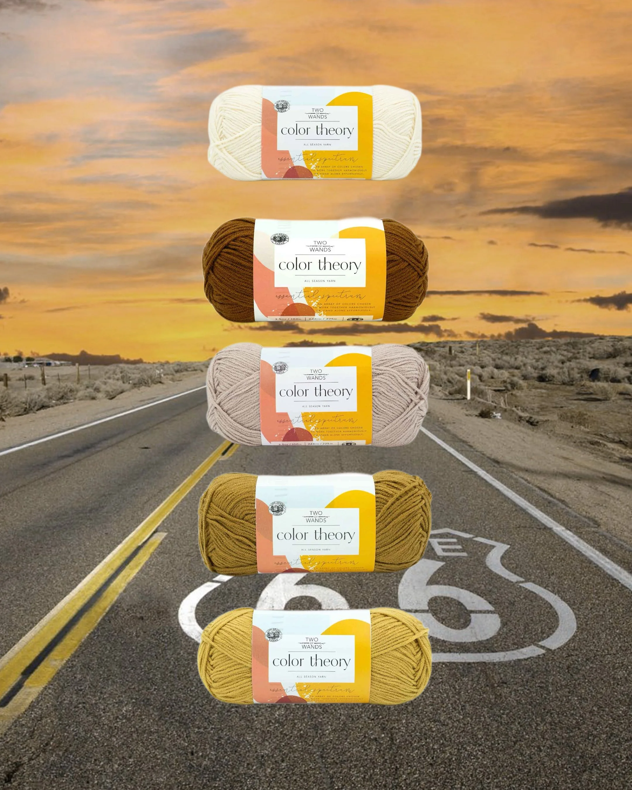
ROUTE 66
Featuring: Ivory, Spice, Bone, Dijon, Bee Pollen
SANTA FE
Featuring: Bone, Amethyst, Moonbeam, Canyon, Himalayan Salt
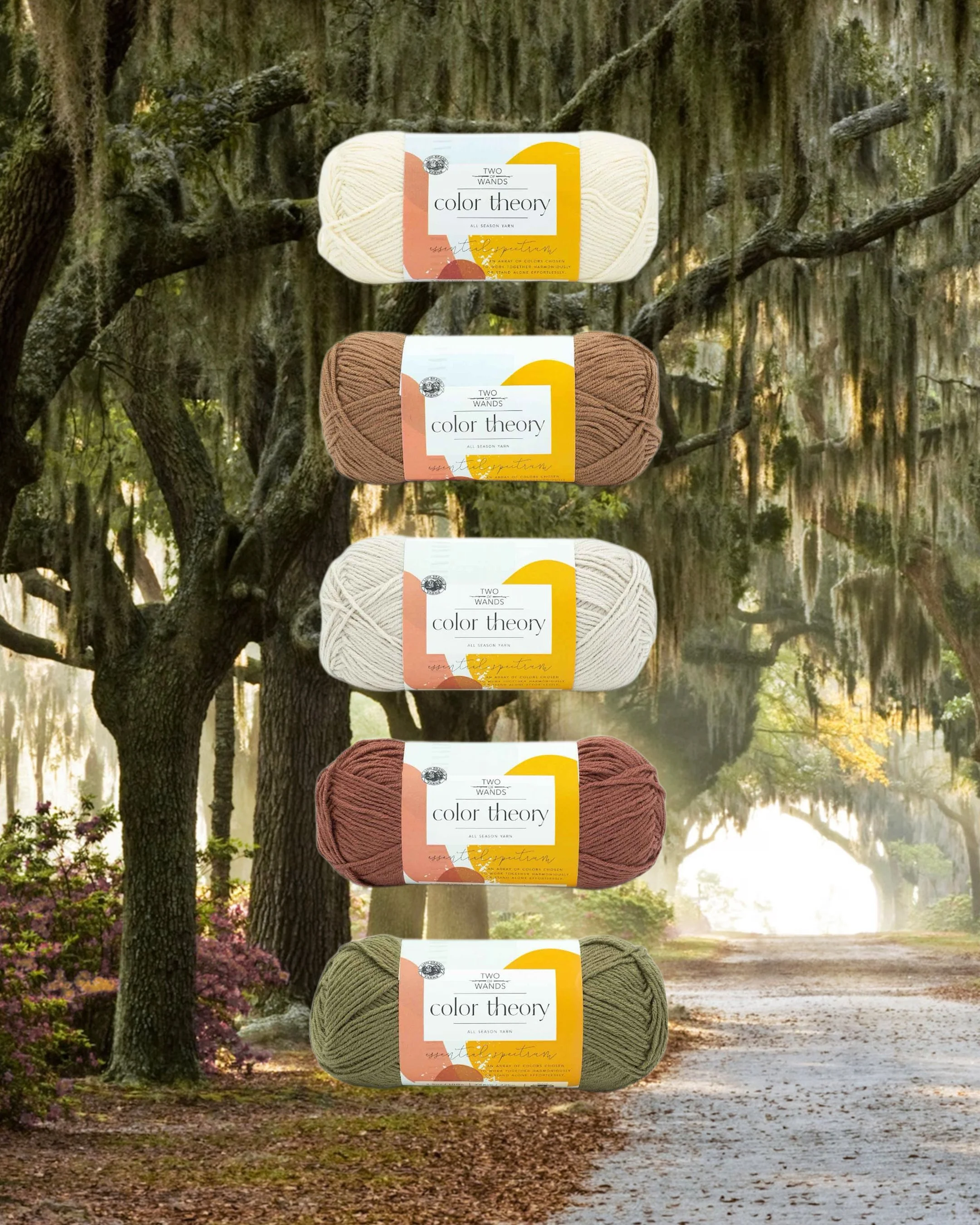
SAVANNAH
Featuring: Ivory, Nutmeg, Moonbeam, Raisin, Caper
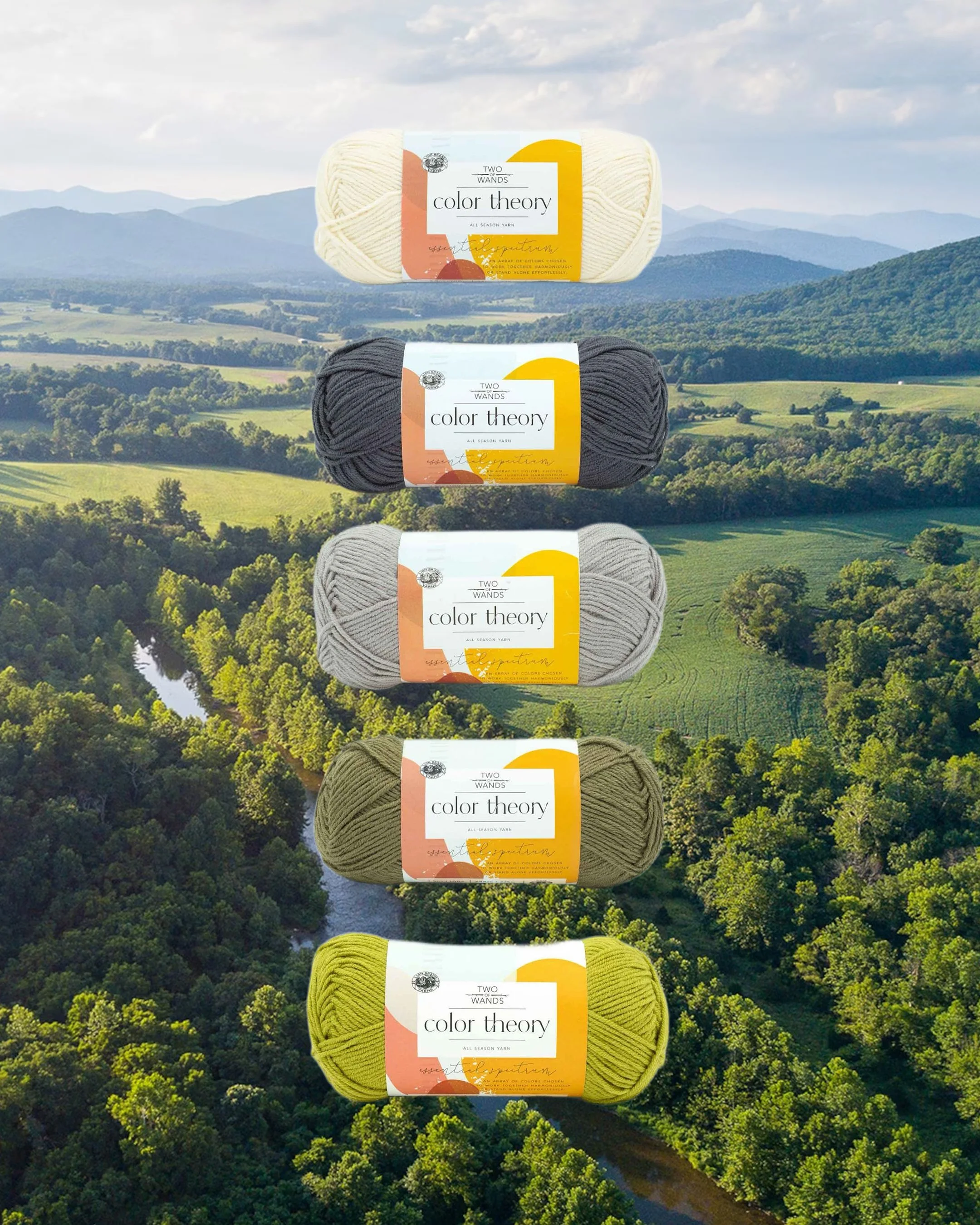
SHENANDOAH VALLEY
Featuring: Ivory, Thunder, Satellite, Caper, Citron
TELLURIDE
Featuring: Moonbeam, Fig, Satellite, Provence, Amethyst
ZION NATIONAL PARK
Featuring: Himalayan Salt, Dijon, Tourmaline, Canyon, Peacock
All of these combos above are also put together in the order I recommend using each color (A, B, C, D, and E from the top down). When putting together a color combo for the Coast to Coast Wrap, there are a few “rules” or guidelines to follow if you want your finished piece to have a nice flow with high contrast and color progression like the original. Here are my biggest tips:
Choose 5 colors that compliment each other well and assign them A, B, C, D, and E
Colors A and D are the dominant colors, since you’ll be using two skeins of each of them and only one skein of each of the other colors. Color A makes up a large portion of the center of the wrap, and color D is used for the edging and the tassels. In the original, these are Natural Heather (A) and Navy (D) and for my updated sample these are Ivory (A) and Raisin (D)
Colors A and C should be the lightest or most neutral colors in the combo. In the original, these are Natural Heather (A) and Oxford Grey (C) and for my updated sample these are Ivory (A) and Moonbeam (C)
Colors B, D, and E should be the darkest or brightest/most bold in the combo. In the original, these are Cocoa (B), Navy (D), and Charcoal (E) and for my updated sample these are Nutmeg (B), Raisin (D), and Canyon (E)
Colors C and D should have high contrast. In the original, these are Oxford Grey (C) and Navy (D) and for my updated sample these are Moonbeam (C) and Raisin (D)
Colors B and E should have high contrast. In the original, these are Cocoa (B) and Charcoal (E) and for my updated sample these are Nutmeg (B) and Canyon (E)
Colors A and E should have high contrast. In the original, these are Natural Heather (A) and Charcoal (E) and for my updated sample these are Ivory (A) and Canyon (E)
Whew, ok now that we’ve chosen our colors, it’s time to dive into the pattern!
View the free pattern here.
Shop the printer-friendly PDF here.
Shop the kit here.
And remember that tutorial videos will be dropping once the KAL officially starts on January 5th!
For those of you interested in modifications for the size of the wrap, keep scrolling!
MODIFICATIONS
Over the years I’ve received countless inquiries on how to increase the size of the Coast to Coast Wrap to turn it into a blanket, and I’ve done some math to you on the right track to scaling this to the size you prefer should you also want to do that! It’s also possible to make this a more narrow scarf, and I recently saw someone post a poncho version to their Ravelry projects! The great thing about this KAL is that since the pattern was released back in 2018, there are already 260 projects posted to Ravelry so you can peruse those to get ideas for other color combos and modifications.
When it comes to the length of the Coast to Coast Wrap, the easiest way to adjust it is to add or remove rows between the charts and at the middle/back of the wrap. When it comes to the width, things get a little more tricky because we have to take into consideration the stitch counts for the repeats of the mosaic charts. In order for all of the charts to work out, we have to have a stitch count that is divisible by 6, 8, and 16, plus 3 edge stitches. The first/lowest number to be divisible by all of those is 48. So to increase or decrease the width, you have to do so in increments of 48. To make a more narrow wrap, subtract 48 from the original 99 stitches and you get 51. Remember that our charts have 3 edge stitches outside of the repeats, so 51-3=48 which is divisible by 6, 8, and 16. Unfortunately, this is the most narrow the wrap can be. To make a wider throw or blanket, add increments of 48 to the original stitch count of 99 to make it as wide as you like.
In order to calculate how many stitches and rows to add or remove to get to a specific dimension, you can use the gauge. This pattern calls for a gauge of 15 sts + 20 rows = 4”/10cm in stockinette. This means that for every 4”/10cm you want to add or subtract, you need to add or remove 15 sts or 20 rows. When it comes to the number of rows (length), you use the gauge to determine exactly how many to add or remove to reach your dimension, and then spread them out throughout the pattern in between the mosaic charts or at the center back. When it comes to the number of stitches (width), you’ll need to use your desired measurement to calculate the number of rows, and then select the closest multiple of 48+3 to that number.
And of course, if you’re adjusting the size of the wrap, you also need to adjust the amount of yarn you’ll need. For anything smaller than the original wrap, I would still recommend purchasing the amount of each color of yarn listed in the pattern to ensure you don’t run out. For projects bigger than the wrap, multiply the number of skeins of each color by how many times wider yours will be from the original. For example, if you decide to make a throw that is twice as wide as the wrap at 195 sts (99 sts + 48 + 48), you’ll need twice as many skeins of each color. If you decide to make a throw that is 2.5x as wide as the wrap at 243 sts (99 + 48 + 48 + 48), you’ll need 2.5x the amount of each color.
Happy mathing! x